
For the ZDF Neo series CHABOS, commissioned by the BBC, I had the honor of designing and animating all graphic elements. This included the title design, eight unique title sequences, explanatory graphics, text inserts, social media assets, and much more. CHABOS is an eight-part nostalgic journey back to 2006 — a time when ICQ, StudiVZ & Co. still shaped our digital lives, and smartphones were nowhere in sight.
Clippy says hi. Not my work of course. Just for nostalgic fun. :)
Below you'll find the motion reel, a curated glimpse into
the animations and designs I created for the project.
the animations and designs I created for the project.
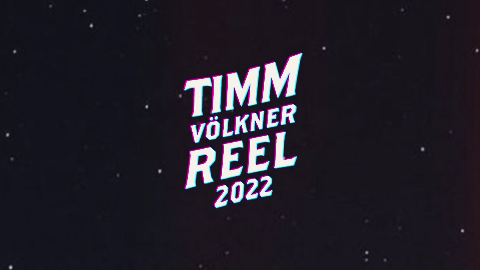
CHABOS Motion Reel 2025
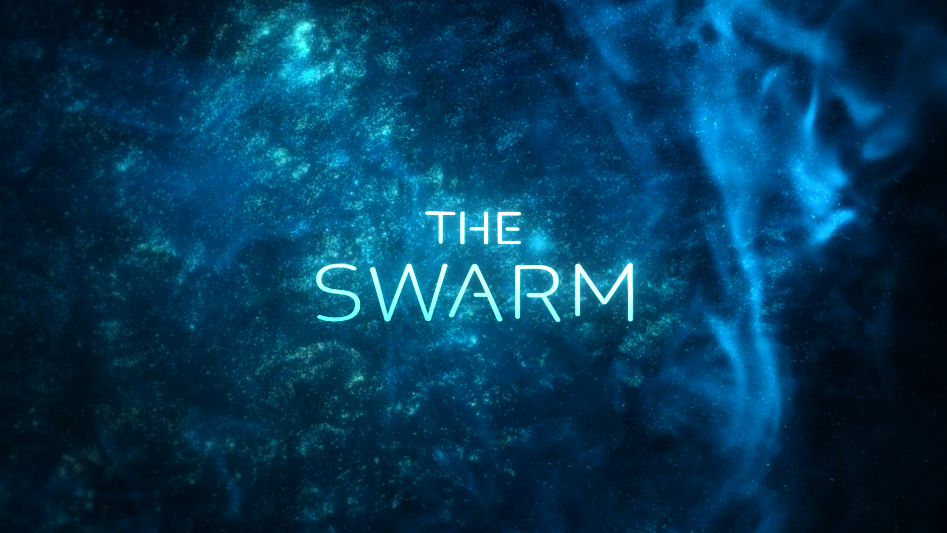
The heart of my work for CHABOS was without doubt the creation of eight distinct title sequences. I explored a wide range of concepts - from playful nods to Windows Media Player visualizers, to more classic 2.5D abstract, poppy BRAVO-magazine worlds where Peppi becomes trapped inside photos and Y2K-inspired elements he can interact with.
Among other ideas I wanted to stress the fact that the two Peppis are the same person and experimented with different face morphing techniques within After Effects. It didn't make the cut, but was worth a try and in hindsight really interesting to look at.
Among other ideas I wanted to stress the fact that the two Peppis are the same person and experimented with different face morphing techniques within After Effects. It didn't make the cut, but was worth a try and in hindsight really interesting to look at.
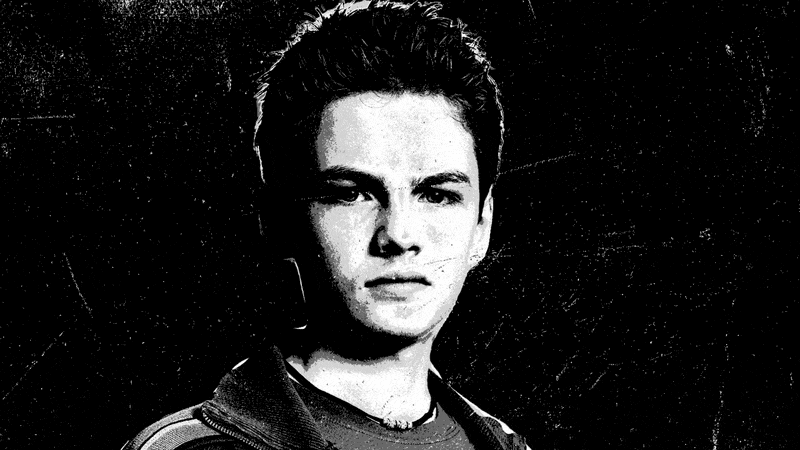
Quick morph between young and old Peppi
Below you can see an almost entirely animated concept, which then shifts into storyboard frames and a provisional title design. In this version, the older Peppi wanders through the cold realm of social media, until an invitation whisks him into the colorful Y2K world. Emerging from a CRT monitor, he chases the letter — a symbol of both the reunion and the fine he owes in the past.
Early draft of different title sequence concept
Early title sequence mockup for "BRAVO magazine" style approach
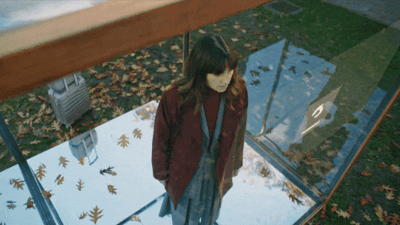
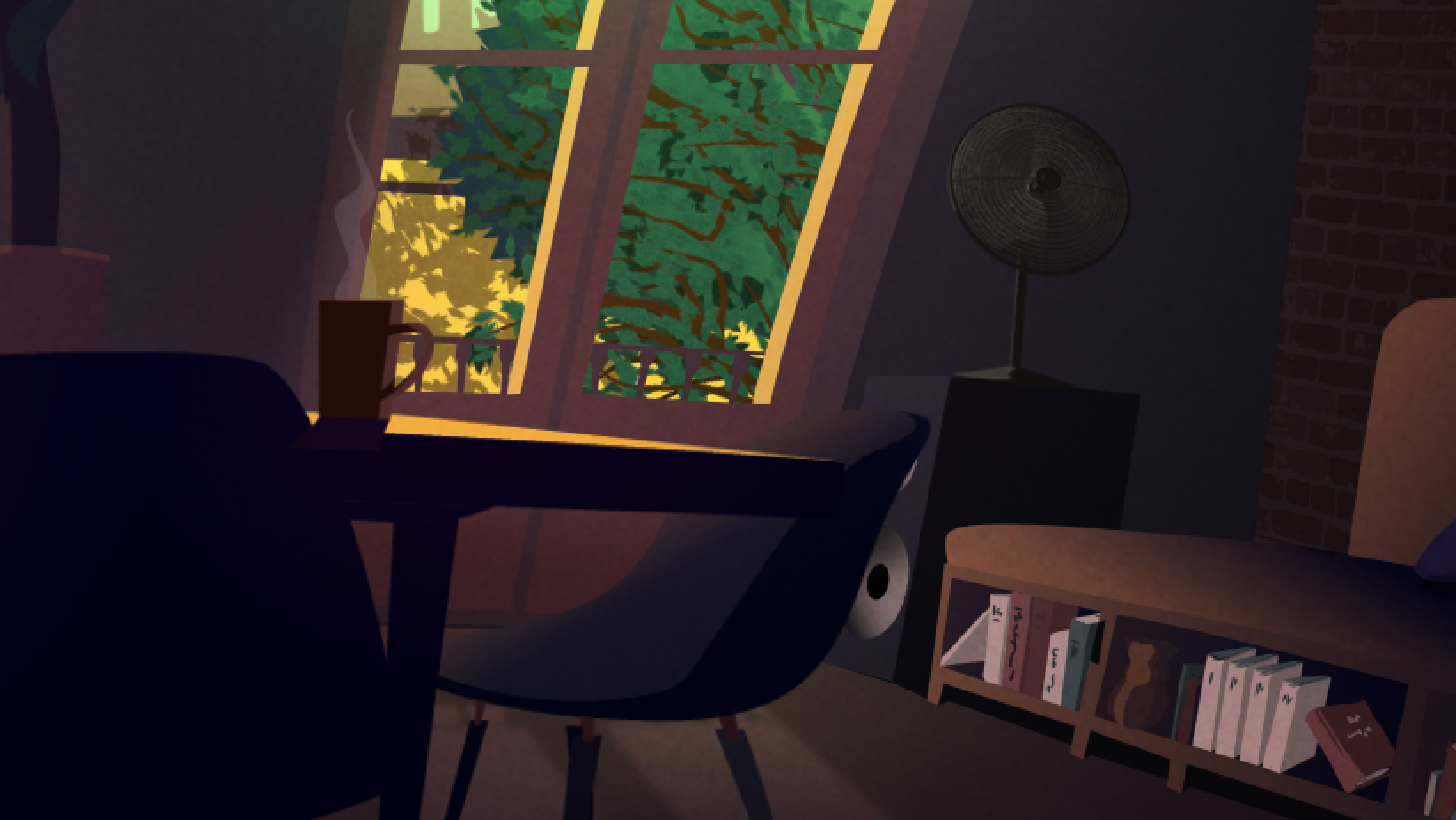
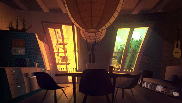
Ultimately, we decided to go with the initial idea: animating a camera through layered photos to create parallax effects. While the technique itself isn’t new (it was famously used in How I Met Your Mother, a 2000s classic), building entire layered photo-worlds that allowed the camera to move seamlessly was one of the most elaborate parts of the project. To further support the narrative arc, I designed a unique intro for each episode. Every sequence incorporated images from the previous episode, serving both as a visual recap and as a creative way to underline the progression of the story. Here's the intro sequence for episode 04 using a song called "Beasty Boyz" specifically created for the show by HYVE.
Final title sequence for episode 1-04
Because CHABOS is set in both 2025 and 2006, the designs had to oscillate between sleek, contemporary looks and deliberately mid-2000s aesthetics.
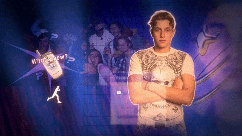
For example, in a 2025 scene where Peppi scrolls through his social media feeds while walking down the street, I developed a modern hologram-style interface that blends the virtual world with the physical environment he inhabits. Each social platform design had to be rebuilt from scratch and subtly altered for legal reasons — while still feeling authentic. This also opened the door for some hidden easter eggs within contacts, posts, and other details.
Social media search animation, ep 1-01
While developing different title treatments, I also immersed myself in the world of Y2K design, using its bold, futuristic kitsch as a creative foundation. Initially, I explored the familiar territory of the time—using typefaces like EUROSTYLE and NEO-SYBER and adopting a chrome sheen as a natural first step in the design process.
Early "chrome" approach for CHABOS title design
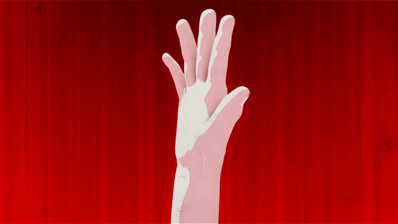
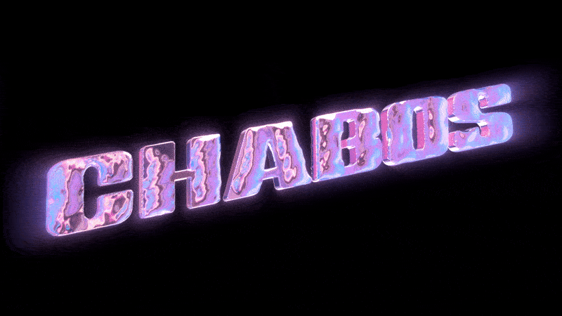
However, one key request from directors Arkadij and Mickey was to rather incorporate the "trashiness" of early Microsoft WordArt - those preset styles that often looked unintentionally awkward or “ugly.”
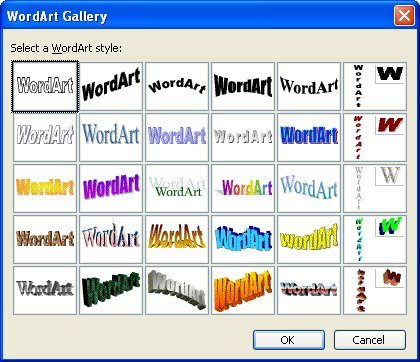
Collection of different WordArd templates from the 2000s
I recreated several of them in a modernized way, then elevated them through animation, transforming what was once considered cheap into something of aesthetic and hopefully nostalgic value, yes including Gollum's grey shadow. Classic design key principles like reduction, clarity and elegance slightly had fade into the background for a moment. :)


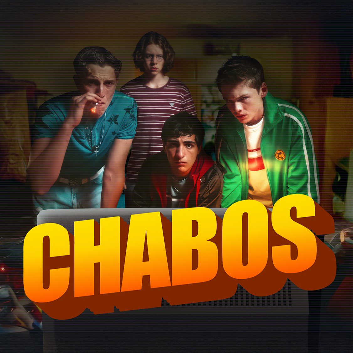
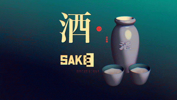
The inofficial key visual
Working on CHABOS was a great experience and a lot of fun. It brought together not only an amazing cast but also a wonderful team behind the scenes. I’m especially grateful to Mickey and Arkadij for those long brainstorming sessions and their constant open-mindedness.
❤️